
A contact form may look like a small website element, but it often decides whether a visitor becomes a useful enquiry or leaves without action. Many businesses invest in SEO, ads and landing pages, yet the final enquiry step remains weak. When the form is confusing, too long or hard to use on mobile, users hesitate. When it is simple, relevant and trustworthy, it can help a business receive more qualified leads.
The goal is not only to collect more messages. The real goal is to Optimize Contact Forms so your team receives better details from people who are more likely to need your service. A good form saves sales time, improves follow up and gives visitors a smoother path to contact you.
This guide explains how to improve structure, fields, CTA, placement, mobile usability, trust and tracking so your website can turn interested visitors into useful enquiries.
Table of Contents
What Is Optimize Contact Forms?
Contact form optimization means improving the layout, wording, fields, call to action and tracking of a form so more users complete it with helpful details. It is not about adding more questions. It is about asking the right questions in a simple way.
A strong website optimize contact forms should feel easy for the visitor and useful for your business. It should collect enough information to understand the requirement, but it should not make users feel that the process is heavy. It should also explain what happens after submission, such as a call back, consultation or email response.
For better website lead generation, your form must support user comfort and business clarity at the same time.

Why Contact Forms Matter for Lead Quality
A form is not only a message box. It is the bridge between website traffic and sales follow up. If users send incomplete details, your team spends more time asking basic questions. If the form asks too much too soon, users may leave before submitting.
A smart lead generation form helps you understand user intent. It can show which service the visitor needs, how soon they want help and whether they are ready to speak with your team. This is why form structure has a direct impact on qualified leads.
Better forms can also increase qualified enquiries by helping serious users explain their needs clearly. At the same time, they can reduce irrelevant requests, spam messages and incomplete submissions.
Start With the Purpose of the Form
Before changing the layout, decide what the form should achieve. A contact page form, service page form and consultation request form may have different goals.
Common form goals include:
- General enquiry from website visitors
- Request for consultation
- Quote request for a service
- Callback request
- Download or resource access
- Support request for existing customers
A lead capture form used for a downloadable guide should usually be shorter than a service consultation form. A business enquiry form may need fields related to service type, company size, budget and timeline. A sales enquiry form may need more intent based details because the user is closer to making a decision.
When the purpose is clear, it becomes easier to decide what information you need and what you can remove.
Keep the Form Short but Useful
Users do not want to fill out a complicated form unless they strongly trust your brand. This is why short contact forms often work well for first time visitors. However, short does not mean weak. The form should still collect details that help your team respond properly, and conversion rate optimization A/B testing can help you understand which field length, layout and CTA bring better results.
Useful fields for most service forms include:
- Name
- Email address
- Phone number
- Service required
- Message or requirement
- Preferred contact time
For service based businesses, adding a budget or timeline field can help qualify enquiries, but it should be optional unless it is necessary. The best contact form fields are those that help the user explain their need without creating pressure.
If a field does not help the user or your team, remove it. Every extra field should have a clear reason.
Use Lead Qualification Without Making the Form Heavy
A lead qualification form helps your team understand whether the enquiry is suitable for your service. It does not need to feel like a long survey. Simple dropdowns, checkboxes and optional fields can collect useful details without adding too much effort.
Smart qualification questions can include:
- Which service are you looking for?
- What is your main goal?
- When do you want to start?
- What is your expected budget range?
- How should we contact you?
For B2B lead generation form pages, qualification fields can be more specific because business buyers often expect a detailed enquiry process. Still, the form should remain easy to complete.
The aim is lead quality improvement, not adding barriers. A form should guide serious users, not push them away.
Improve the CTA Button
The button text matters more than many businesses think. A weak CTA like “Submit” feels plain and gives no clear value. Better wording can make the next step more obvious and improve website conversion rate.
Form CTA optimization means writing button text that matches user intent. The text should explain what the visitor will get after sending the form.
Better CTA examples:
- Request a Call Back
- Get a Free Consultation
- Send My Enquiry
- Talk to a Specialist
- Request Website Review
A clear CTA can improve form submissions because users understand the action. However, the CTA should be honest. Do not promise an instant result if your team cannot provide it.

Place Forms Where User Intent Is Strong
Contact form placement affects how many people notice and use the form. If users have to search too much, they may leave. If the form appears before users understand your service, they may not be ready. Good placement also supports mobile usability because users should be able to find and complete the form easily on any device.
Good places to add forms include:
- Near the top of a service page
- After explaining service benefits
- Near pricing or consultation sections
- On the contact page
- At the end of useful blog posts
- On focused landing page forms
A service page can include a shorter form near the top and a more detailed form lower on the page. This supports different user readiness levels.
Improve Contact Form Design for Better User Experience
Contact form design should make the form look simple, clean and easy to complete. Users should instantly understand where to type, which fields are required and what action they need to take next.
Good spacing, readable labels, clear error messages and a visible button can make a big difference. This is also why businesses that invest in professional web design services in Kolkata should focus on forms as part of the overall user experience. Do not hide labels inside fields only, because users may forget what they are entering once they start typing.
These contact form best practices help reduce confusion and support better form conversions without making the page feel pushy.
Make the Form Easy on Mobile
Many users visit websites from mobile devices. If the form is hard to tap, read or complete on a phone, users may leave before submitting. Mobile friendly contact forms are now a basic requirement for any business website.
Mobile form tips:
- Use a single column layout
- Make input boxes large enough
- Keep labels visible
- Use clear spacing
- Use tap friendly buttons
- Avoid tiny dropdowns
- Reduce typing where possible
A smooth form user experience matters because mobile users often act quickly. They may be comparing services or searching for help during a short break. Your form should make the next step simple.
Add Trust Around the Form
People hesitate before sharing their contact details. They may worry about spam, unwanted calls or privacy. This is why DPDP Act and lead generation should be considered when collecting user information through website forms. Trust signals on forms can reduce this hesitation and make users feel more comfortable.
Helpful trust signals include:
- Privacy message
- Response time statement
- Business contact details
- Review snippet
- Secure form note
- No spam message
- Clear reason for collecting details
You can add a simple line below the form such as: “Your details are safe. We will only use them to respond to your enquiry.” This small message can support better form conversions because it addresses a common concern.

Reduce Spam and Poor Quality Submissions
Not every submission is useful. Spam, fake emails and irrelevant messages can waste sales time. To keep the process clean, create spam free contact forms with the right checks.
Useful spam control methods include:
- CAPTCHA or invisible spam protection
- Email format checks
- Phone number checks
- Hidden spam fields
- Blocked keyword filtering
- Service specific dropdowns
Form validation also helps users correct errors before submission. For example, if someone enters the wrong email format, the form should show a clear message instead of simply failing.
Connect Forms With CRM and Follow Up
A form submission has value only when your team responds properly. If leads stay in an inbox for hours or days, the opportunity may be lost. CRM lead capture helps store enquiry details, assign leads and track the source.
A proper lead nurturing process can include an instant confirmation email, internal notification, sales assignment and follow up reminder. This helps your team respond faster, manage sales funnel leads with more clarity and support a reduce lead leakage CRM process.
For local and service businesses, speed matters. A visitor who submits a customer enquiry form may also contact other providers. Fast response can improve your chance of turning that enquiry into a client.
Track Form Performance
You cannot improve what you do not measure. Form conversion optimization requires regular review of how users interact with the form, how many enquiries become real opportunities and how each change affects the lead conversion rate.
Important metrics to track:
- Form views
- Form submission rate
- Drop off rate
- Enquiry source
- Qualified enquiry percentage
- Response time
- Lead to customer conversion
Your website conversion rate optimization services can improve when the form becomes easier and more relevant. If many users view the form but do not submit it, the issue may be field length, CTA wording, trust, loading speed or page content.
Avoid Common Contact Form Mistakes
Many websites lose leads because of small but costly errors. These contact form mistakes can reduce trust and make users leave.
Avoid these issues:
- Asking for too many details too early
- Using unclear CTA text
- Placing the form too low on the page
- Not testing the form on mobile
- Not showing error messages clearly
- Not confirming successful submission
- Not connecting the form with tracking
- Not replying quickly to enquiries
Conversion focused forms are built with the user in mind. They are simple, clear and connected to a proper response process.
Contact Form Checklist
| Form Area | What to Improve | Why It Matters |
|---|---|---|
| Headline | Explain the next step clearly | Helps users understand the purpose |
| Fields | Ask only useful questions | Reduces effort and improves lead data |
| CTA | Use action based wording | Encourages users to submit |
| Mobile layout | Use large fields and clean spacing | Improves mobile completion |
| Trust message | Add privacy and response note | Reduces hesitation |
| Validation | Show helpful error messages | Prevents failed submissions |
| CRM | Send leads to the right team | Improves follow up |
| Analytics | Track views and submissions | Helps improve results over time |
Case Study: How a Service Business Improved Lead Quality
A service based business was getting regular form submissions, but the sales team found that many enquiries had missing details, unclear requirements or no serious buying intent. The form was short, but it did not help the team understand what the user needed.
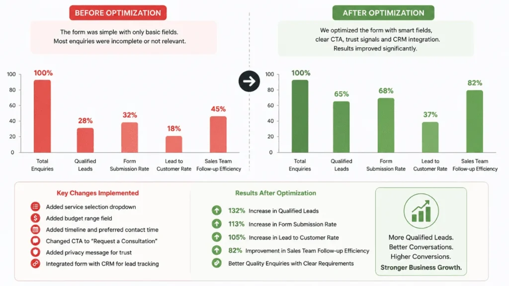
The business changed the headline, added a service selection dropdown, included a preferred contact time field and changed the CTA from “Submit” to “Request a Consultation.” A privacy note was placed below the form, and enquiry tracking was connected.
After these changes, random submissions reduced. The team received clearer details and could respond with more relevant information. The business did not focus only on volume. It focused on getting better enquiries from users with real interest.
The learning is simple. A form should not only collect contact details. It should help the visitor explain their need and help the business respond in a useful way.
Make Forms Ready for SEO, AEO and Voice Search
A form itself may not rank in search, but the page around the form can attract visitors and guide them toward action. Online form optimization works better when the page clearly answers user questions before asking for an enquiry. To optimize content for PAA box opportunities, add short, direct answers around common form related questions so search engines and users can understand the page faster.
How many fields should a contact form have?
A contact form should have only the fields needed to understand the enquiry. For simple forms, name, email, phone and message may be enough. For service pages, service type, budget and timeline can help your team respond better.
What makes high converting contact forms work?
High converting contact forms work because they are easy to complete, clearly placed, mobile friendly, supported by trust messages and connected with fast follow up.
How can I reduce form abandonment?
You can reduce form abandonment by removing unnecessary fields, using clear labels, improving page speed, making the form mobile friendly and explaining what happens after submission.
These short answer sections can help readers and search engines understand the content faster. They also support voice search because the answers are direct and conversational.
FAQs
Q: What is contact form optimization?
Ans: It is the process of improving a form so more users complete it with useful information. It includes better fields, CTA text, layout, trust messages, mobile experience and tracking.
Q: Why should businesses improve their contact forms?
Ans: Businesses should improve their forms because a better form can bring clearer enquiries, reduce low quality submissions and help sales teams respond faster. It improves user experience and lead handling.
Q: How many fields should a contact form include?
Ans: A form should include only the fields needed to understand the user’s request. For a simple enquiry, a few fields may be enough. For a service enquiry, a dropdown for service type and an optional timeline can help.
Q: What is the best CTA for a contact form?
Ans: The best CTA is clear and action based. Examples include “Request a Call Back,” “Get a Free Consultation” and “Send My Enquiry.” The CTA should match what the user will receive after submitting the form.
Q: How can I get more service business leads from my website?
Ans: You can get more service business leads by improving your content, using clear service pages, adding relevant forms, asking useful qualification questions and responding quickly to enquiries.
Q: Why do users leave contact forms without submitting?
Ans: Users leave when forms are too long, confusing, slow, not mobile friendly or ask for sensitive details without explaining why. Clear design and trust messages can reduce this problem.
Q: Should I use a long or short form?
Ans: Use a short form for first time visitors and simple enquiries. Use a slightly detailed form when users are closer to making a decision, such as on consultation or quote request pages.
Q: How do I know if my form is working?
Ans: Track form views, submissions, source, drop off rate and lead quality. If many users view the form but few submit it, review the fields, CTA, placement and mobile experience.
Conclusion
A contact form is one of the most important conversion points on a business website. It should not be treated as a basic box at the end of a page. It should guide users, collect useful details and help your team respond with clarity.
To get better results, keep the form simple, use relevant qualification fields, write a clear CTA, place the form where intent is strong, make it mobile friendly and connect it with tracking. When you Optimize Contact Forms with both user experience and lead quality in mind, your website can generate more meaningful enquiries and support better business growth.